# Creating the list to install
pkgs <- c(
  "ergm", "sna", "igraph", "intergraph", "netplot", "netdiffuseR", "rgexf"
  )

# Checking if we can load them and install them if not available
for (pkg in pkgs) {
  if (!require(pkg, character.only = TRUE)) {

    # If not present, will install it
    install.packages(pkg, character.only = TRUE)

    # And load it!
    library(pkg, character.only = TRUE)

  }
}Simulation and vizualization
In this chapter, we will build and visualize artificial networks using Exponential Random Graph Models [ERGMs.] Together with chapter 3, this will be an extended example of how to read network data and visualize it using some of the available R packages out there.
For this chapter, we will be using the following R packages:
ergm: To simulate and estimate ERGMs.sna: To visualize networks.igraph: Also to visualize networks.intergraph: To convert betweenigraphandnetworkobjects.netplot: Again, for visualization.netdiffuseR: For a single function we use for adjusting vertex size in igraph.rgexf: For building interactive (html) figures.
You can use the following codeblock to install any missing package:
A recorded version is available here.
Random Graph Models
While there are tons of social network data, we will use an artificial one for this chapter. We do this as it is always helpful to have more examples simulating Random networks. For this chapter, we will classify random graph models for sampling and generating networks into three categories:
Exogenous: Graphs where the structure is determined by a macro rule, e.g., expected density, degree distribution, or degree-sequence. In these cases, ties are assigned to comply with a macro-property.
Endogenous: This category includes all Random Graphs generated based on endogenous information, e.g., small-world, scale-free, etc. Here, a tie creation rule gives origin to a macro property, for example, preferential attachment in scale-free networks.
Exponential Random Graph Models: Overall, since ERGMs compose a family of statistical models, we can always (or almost always) find a model specification that matches the previous categories. Whereas we are thinking about degree sequence, preferential attachment, or a mix of both, ERGMs can be the baseline for any of those models.
The latter, ERGMs, are a generalization that covers all classes. Because of that, we will use ERGMs to generate our artificial network.
Reading a network
The first step to analyzing network data is to read it in. Many times you’ll find data in the form of an adjacency matrix. Other times, data will come in the form of an edgelist. Another common format is the adjacency list, which is a compressed version of an edgelist. Let’s see how the formats look like for the following network:
example_graph <- matrix(0L, 4, 4, dimnames = list(letters[1:4], letters[1:4]))
example_graph[c(2, 7)] <- 1L
example_graph["c", "d"] <- 1L
example_graph["d", "c"] <- 1L
example_graph <- as.network(example_graph)
set.seed(1231)
gplot(example_graph, label = letters[1:4])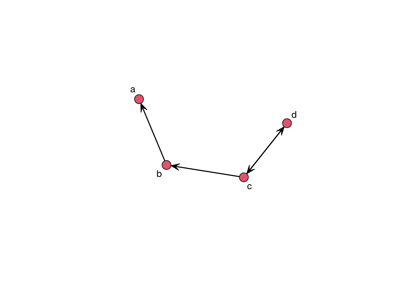
- Adjacency matrix a matrix of size n by n where the ij-th entry represents the tie between i and j. In a directed network, we say i connects to j, so the i-th row shows the ties i sends to the rest of the network. Likewise, in a directed graph, the j-th column shows the ties sent to j. For undirected graphs, the adjacency matrix is usually upper or lower diagonal. The adjacency matrix of an undirected graph is symmetric, so we don’t need to report the same information twice. For example:
as.matrix(example_graph) a b c d
a 0 0 0 0
b 1 0 0 0
c 0 1 0 1
d 0 0 1 0- Edge list a matrix of size |E| by 2, where |E| is the number of edges. Each entry represents a tie in the graph.
as.edgelist(example_graph) [,1] [,2]
[1,] 2 1
[2,] 3 2
[3,] 3 4
[4,] 4 3
attr(,"n")
[1] 4
attr(,"vnames")
[1] "a" "b" "c" "d"
attr(,"directed")
[1] TRUE
attr(,"bipartite")
[1] FALSE
attr(,"loops")
[1] FALSE
attr(,"class")
[1] "matrix_edgelist" "edgelist" "matrix" "array" The command turns the network object into a matrix with a set of attributes(which are also printed.)
- Adjacency list This data format uses less space than edgelists as ties are grouped by ego (source.)
igraph::as_adj_list(intergraph::asIgraph(example_graph)) [[1]]
+ 1/4 vertex, from 1931f52:
[1] 2
[[2]]
+ 2/4 vertices, from 1931f52:
[1] 1 3
[[3]]
+ 3/4 vertices, from 1931f52:
[1] 2 4 4
[[4]]
+ 2/4 vertices, from 1931f52:
[1] 3 3The function igraph::as_adj_list turns the igraph object into a list of type adjacency list. In plain text it would look something like this:
2
1 3
2 4 4
3 3
Here we will deal with an edgelist that includes node information. In my opinion, this is one of the best ways to share network data. Let’s read the data into R using the function read.csv:
edges <- read.csv("06-edgelist.csv")
nodes <- read.csv("06-nodes.csv")
We now have two objects of class data.frame, edges and nodes. Let’s inspect them using the head function:
head(edges) V1 V2
1 1 99
2 2 111
3 3 102
4 3 117
5 4 164
6 5 12head(nodes) vertex.names race age
1 1 non-white 10
2 2 white 10
3 3 white 17
4 4 non-white 14
5 5 non-white 17
6 6 non-white 14It is always important to look at the data before creating the network. Most common errors happen before reading the data in and could go undetected in many cases. A few examples:
Headers in the file could be treated as data, or the files may not have headers.
Ego/alter columns may show in the wrong order. Both the
igraphandnetworkpackages take the first and second columns of edgelists as ego and alter.Isolates, which wouldn’t show in the edgelist, may be missing from the node information set. This is one of the most common errors.
Nodes showing in the edgelist may be missing from the nodelist.
Both igraph and network have functions to read edgelist with a corresponding nodelist; the functions graph_from_data_frame and as.nework, respectively. Although, for both cases, you can avoid using a nodelist, it is highly recommended as then you will (a) make sure that isolates are included and (b) become aware of possible problems in the data. A frequent error in graph_from_data_frame is nodes present in the edgelist but not in the set of nodes.
net_ig <- igraph::graph_from_data_frame(
  d        = edges,
  directed = TRUE,
  vertices = nodes
)
Using as.network from the network package:
net_net <- network::as.network(
  x        = edges,
  directed = TRUE,
  vertices = nodes
)
As you can see, both syntaxes are very similar. The main point here is that the more explicit we are, the better. Nevertheless, R can be brilliant; being shy, i.e., not throwing warnings or errors, is not uncommon. In the next section, we will finally start visualizing the data.
Visualizing the network
We will focus on three different attributes that we can use for this visualization: Node size, node shape, and node color. While there are no particular rules, some ideas you can follow are:
Node size Use it to describe a continuous measurement. This feature is often used to highlight important nodes, e.g., using one of the many available degree measurements.
Node shape Shapes can be used to represent categorical values. A good figure will not feature too many of them; less than four would make sense.
Node color Like shapes, colors can be used to represent categorical values, so the same idea applies. Furthermore, it is not crazy to use both shape and color to represent the same feature.
Notice that we have not talked about layout algorithms. The R packages to build graphs usually have internal rules to decide what algorithm to use. We will discuss that later on. Let’s start by size.
Vertex size
Finding the right scale can be somewhat difficult. We will draw the graph four times to see what size would be the best:
# Sized by indegree
net_sim %v% "indeg" <- sna::degree(net_sim, cmode = "indegree")

# Changing device config
op <- par(mfrow = c(2, 2), mai = c(.1, .1, .1, .1))

# Plotting
glayout <- gplot(net_sim, vertex.cex = (net_sim %v% "indeg") * 2)
gplot(net_sim, vertex.cex = net_sim %v% "indeg", coord = glayout)
gplot(net_sim, vertex.cex = (net_sim %v% "indeg")/2, coord = glayout)
gplot(net_sim, vertex.cex = (net_sim %v% "indeg")/10, coord = glayout)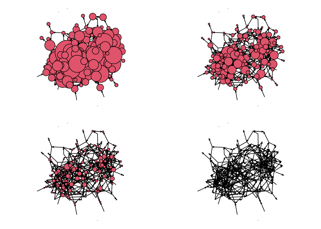
# Restoring device config
par(op)
Line-by-line we did the following:
net_sim %v% "indeg" <- degree(net_sim, cmode = "indegree")Created a new vertex attribute called indegree and assigned it to the network object. The indegree is calculated using thedegreefunction from thesnapackage. Sinceigraphalso has adegreefunction, we are making sure that R usessna’s and notigraph’s. Thepackage::functionnotation is useful for these cases.op <- par(mfrow = c(2, 2), mai = c(.1, .1, .1, .1))This changes the graphical device information to (a)mfrow = c(2,2)have a 2x2 grid by row, meaning that new figures will be added left to right and then top to bottom, and (b) set the margins in the figure to be 0.1 inches in all four sizes.glayout <- gplot(net_sim, vertex.cex = (net_sim %v% "indeg") * 2)generating the plot and recording the layout. Thegplotfunction returns a matrix of size# verticesby 2 with the positions of the vertices. We are also passing thevertex.cexargument, which we use to specify the size of each vertex. In our case, we decided to size the vertices proportional to their indegree times two.gplot(net_sim, vertex.cex = net_sim %v% "indeg", coord = glayout), again, we are drawing the graph using the coordinates of the previous draw, but now the vertices are half the size of the original figure.
The other two calls are similar to four. If we used igraph, setting the size can be more accessible thanks to the netdiffuseR R package. Let’s start by converting our network to an igraph object with the R package intergraph.
library(intergraph)
library(igraph)

# Converting the network object to an igraph object
net_sim_i <- asIgraph(net_sim)

# Plotting with igraph
plot(
  net_sim_i,
  vertex.size = netdiffuseR::rescale_vertex_igraph(
    vertex.size = V(net_sim_i)$indeg,
    minmax.relative.size = c(.01, .1)
  ),
  layout       = glayout,
  vertex.label = NA
)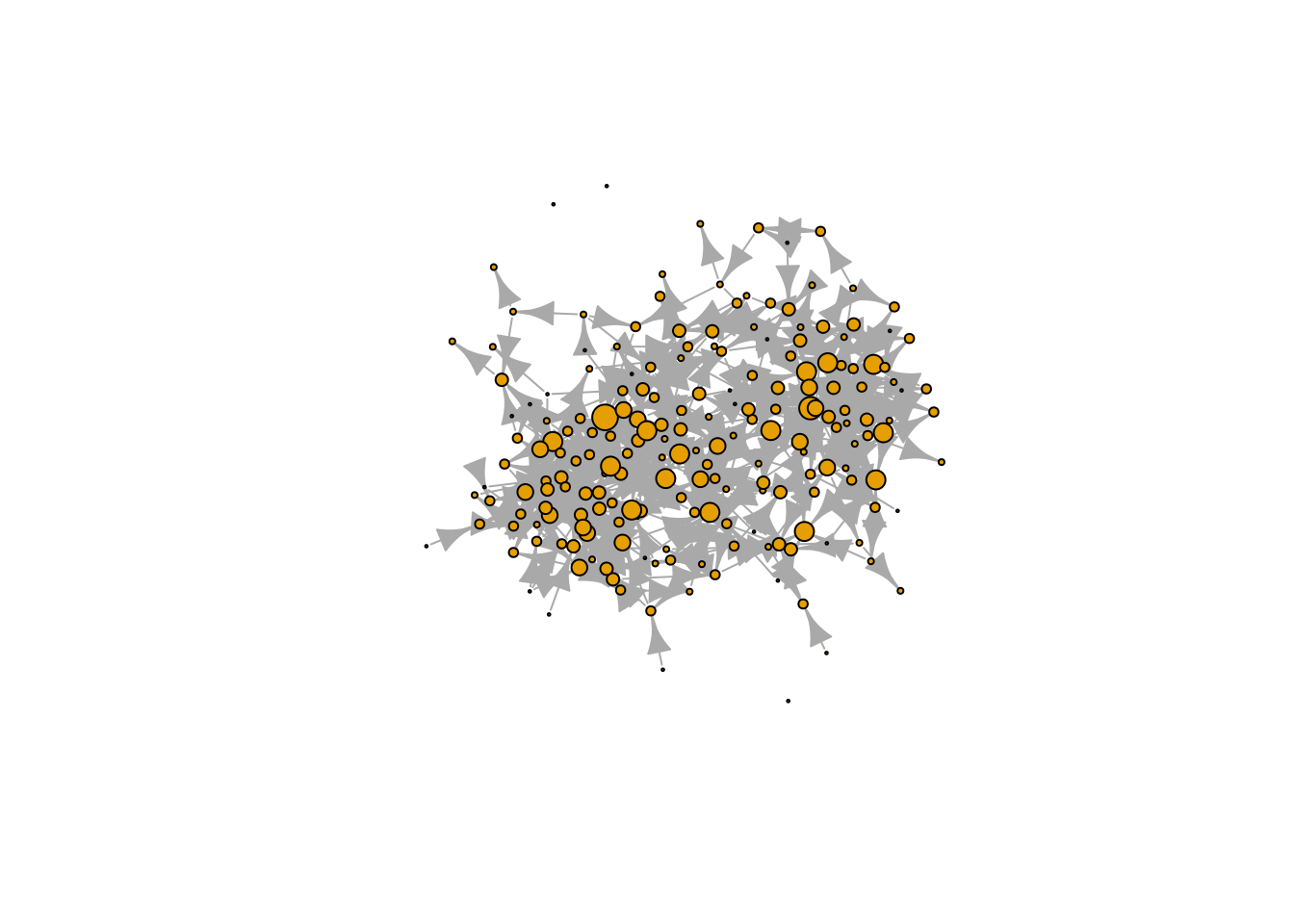
We could also have tried netplot, which should make things easier and make a better use of the space:
library(netplot)
nplot(
  net_sim, layout = glayout,
  vertex.color = "tomato",
  vertex.frame.color = "darkred"
  )
With a good idea for size, we can now start looking into vertex color.
Vertex color
For the color, we will use vertex age. Although age is, by definition, continuous, we only have three values for age. Because of this, we can treat age as categorical. Instead of using nplot we will go ahead with nplot_base. As of this version of the book, the netplot package does not have an easy way to add legends with the core function, nplot; therefore, we use nplot_base which is compatible with the R function legend, as we will now see:
# Specifying colors for each vertex
vcolors_palette <- c("10" = "gray", "14" = "tomato", "17" = "steelblue")
vcolors <- vcolors_palette[as.character(net_sim %v% "age")]
net_sim %v% "color" <- vcolors

# Plotting
nplot_base(
  net_ig,
  layout = glayout,
  vertex.color = net_sim %v% "color",
  )

# Color legend
legend(
  "bottomright",
  legend = names(vcolors_palette),
  fill   = vcolors_palette,
  bty    = "n",
  title  = "Age"
  )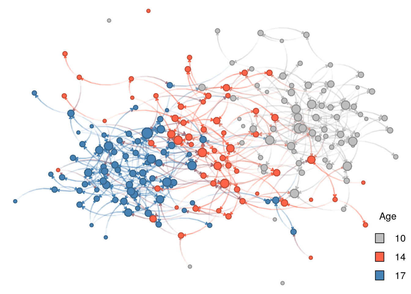
Line by line, this is what we just did:
vcolors <- c("10" = "gray", "14" = "tomato", "17" = "steelblue")we created a character vector with three elements,"gray","tomato", and"blue". Furthermore, the vector has names assigned to it,"10","14", and"17"– the ages we have in the network–so that we can access its elements by indexing by name, e.g., if we typevcolors["10"]R returns the value"gray".vcolors <- vcolors[as.character(net_sim %v% "age")]there are several things going on in this line. First, we extract the attribute “age” from the network using the%v%operator. We then transform the resulting vector from integer type to a character type with the functionas.character. Finally, using the resulting character vector with values"10", "14", "17", ..., we retrieve values fromvcolorsname-indexing. The resulting vector is of length equal to the vertex count in the network.net_sim %v% "color" <- vcolorscreates a new vertex attribute,color. The assigned value is the result from subsettingvcolorsby the ages of each vertex.nplot_base(...finally draws the network. We pass the previously computed vertex coordinates and vertex colors with the new attributecolor.legend(...)Let’s see one parameter at a time:"bottomright"tells the overall position of the legendlegend = names(vcolors)passes the actual legend (text); in our case the ages of individuals.fill = vcolorspasses the colors associated with the text.bty = "n"suppresses wrapping the legend within a box.title = "Age"sets the title to be “Age”.
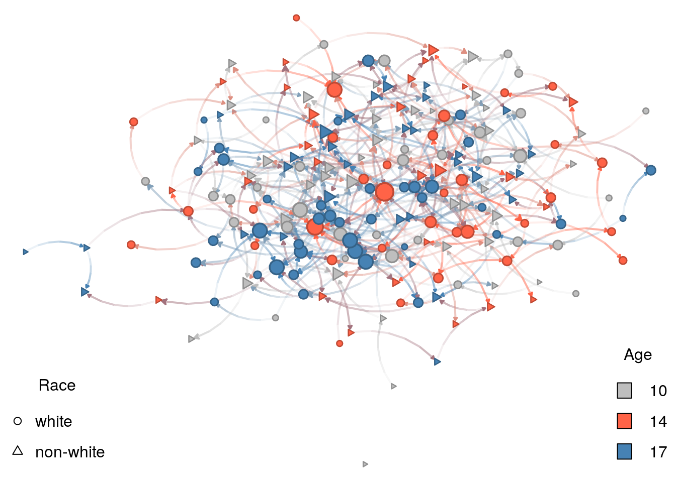
Vertex shape
For the color, we will use vertex age. Although age is, by definition, continuous, we only have three values for age. Because of this, we can treat age as categorical.
# Specifying the shapes for each vertex
vshape_list <- c("white" = 15, "non-white" = 3)
vshape      <- vshape_list[as.character(net_sim %v% "race")]
net_sim %v% "shape" <- vshape

# Plotting
nplot_base(
  net_ig,
  layout = glayout,
  vertex.color = net_sim %v% "color",
  vertex.nsides = net_sim %v% "shape"
  )

# Color legend
legend(
  "bottomright",
  legend = names(vcolors_palette),
  fill   = vcolors_palette,
  bty    = "n",
  title  = "Age"
  )

# Shape legend
legend(
  "bottomleft",
  legend = names(vshape_list),
  pch    = c(1, 2),
  bty    = "n",
  title  = "Race"
  )
Let’s now compare the figure to our original ERGM:
Low density (
edges) Without low density, the figure would be a hairball.Race homophily (
nodematch("race")) Although not surprisingly evident, nodes tend to form small clusters by shape, which, in our model, represents race.Structural balance (
ttriad) A force, in this case, opposite to low density, higher prevalence of transitive triads makes individuals cluster.Age homophily (
absdiff("age")) This is the most prominent feature of the graph. In it, nodes are clustered by age.
Of the four features, age homophily is the one that stands out. Why is this tha case? If we look again at the parameters used in the ERGM and how these interact with vertices’ attributes, we will find the answer:
The log-odds of a new race-homophilic tie are 1\times\theta_{\text{race-homophily}} = 0.5.
But, the log-odd of an age heterophilic tie between, say, 14 and 17 year olds is |17-14|\theta_{\text{age-homophily}} = 3\times -0.5 = -1.5.
Therefore, the effect of heterophily (which is just the opposite of homophily) is significantly larger, actually three times in this case, than the race-homophily effect.
This observation becomes clear if we run another simulation with the same seed, but adjusting for the maximum size the effect of age-homophily can take. A quick-n-dirty way to achieve this is to re-run the simulation with the nodematch term instead of the absdiff term. This way, we (a) explicitly operationalize the term as homophily (before it was heterophily,) and (b) have both homophily effects have the same influence in the model:
net_sim2 <- simulate(
    net ~ edges +
    nodematch("race") +
    ttriad +
    nodematch("age"),
    coef = c(-5, .5, .25, .5) # This line changed
    )
Re-doing the plot. From the previous graph-drawing, only the graph structure changed. The vertex attributes are the same so we can go ahead and re-use them. Like I mentioned earlier, the nplot_base function currently supports igraph objects, so we will use intergraph::asIgraph to make it work:
# Plotting
nplot_base(
  asIgraph(net_sim2),
  # We comment this out to allow for a new layout
  # layout = glayout,
  vertex.color = net_sim %v% "color",
  vertex.nsides = net_sim %v% "shape"
  )

# Color legend
legend(
  "bottomright",
  legend = names(vcolors_palette),
  fill   = vcolors_palette,
  bty    = "n",
  title  = "Age"
  )

# Shape legend
legend(
  "bottomleft",
  legend = names(vshape_list),
  pch    = c(1, 2),
  bty    = "n",
  title  = "Race"
  )
As expected, there is no longer a dominant effect in homophily. One important thing we can learn from this final example is that phenomena will not always show themselves in graph visualization. Careful analysis in complex networks is a must.
Social Networks in Schools
A common type of network we analyze is friendship networks. In this case, we will use ERGMs to simulate friendship networks within a school. In our simulated world, these networks will be dominated by the following phenomena
If you have been paying attention to the previous chapters, you will notice that, out of these five properties, only one constitutes Markov graphs. Within a tie, homophily and density only depend on ego and alter. In race homophily, only ego and alter’s race matter for the tie formation, but, in the case of Structural balance, ego is more likely to befriend alter if a fried of ego is friends with alter, i.e., “the friend of my friend is my friend.”
The simulation steps are as follows:
Draw a population of n students and randomly distribute race and age across them.
Create a
networkobject.Simulate the ties in the empty network.
Here is the code
What just happened? Here is a line-by-line breakout:
set.seed(712)Since this is a random simulation, we need to fix a seed so it is reproducible. Otherwise, results would change with every iteration.n <- 200We are assigning the value200to the objectn. This will make things easier as, if needed, changing the size of the networks can be done at the top of the code.race <- sample(c("white", "non-white"), n, replace = TRUE)We are sampling 200, or actually,nvalues from the vectorc("white", "non-white")with replacement.age <- sample(c(10, 14, 17), n, replace = TRUE)Same as before, but with ages!library(ergm)Loading the ergm R package, which we need to simulate the networks!library(network)Loading thenetworkR package, which we need to create the empty graph.net <- network.initialize(n)Creating an empty graph of sizen.net %v% "race" <- raceUsing the%v%operator, we can access vertices features in the network object. Since race does not exist in the network yet, the operator just creates it. Notice that the number of vertices matches the length of the race vector.net %v% "age" <- ageSame as with race!net_sim <- simulate(Simulating an ERGM! A couple of observations here:The LHS (left-hand-side) of the equation has the network,
netThe RHS (you guessed it) has the terms that govern the process.
For low density, we used the
edgesterm with a corresponding -4.0 for the parameter.For race homophily, we used the
nodematch("race")with a corresponding 0.5 parameter value.For structural balance, we use the
ttriadterm with parameter 0.25.For age homophily, we use the
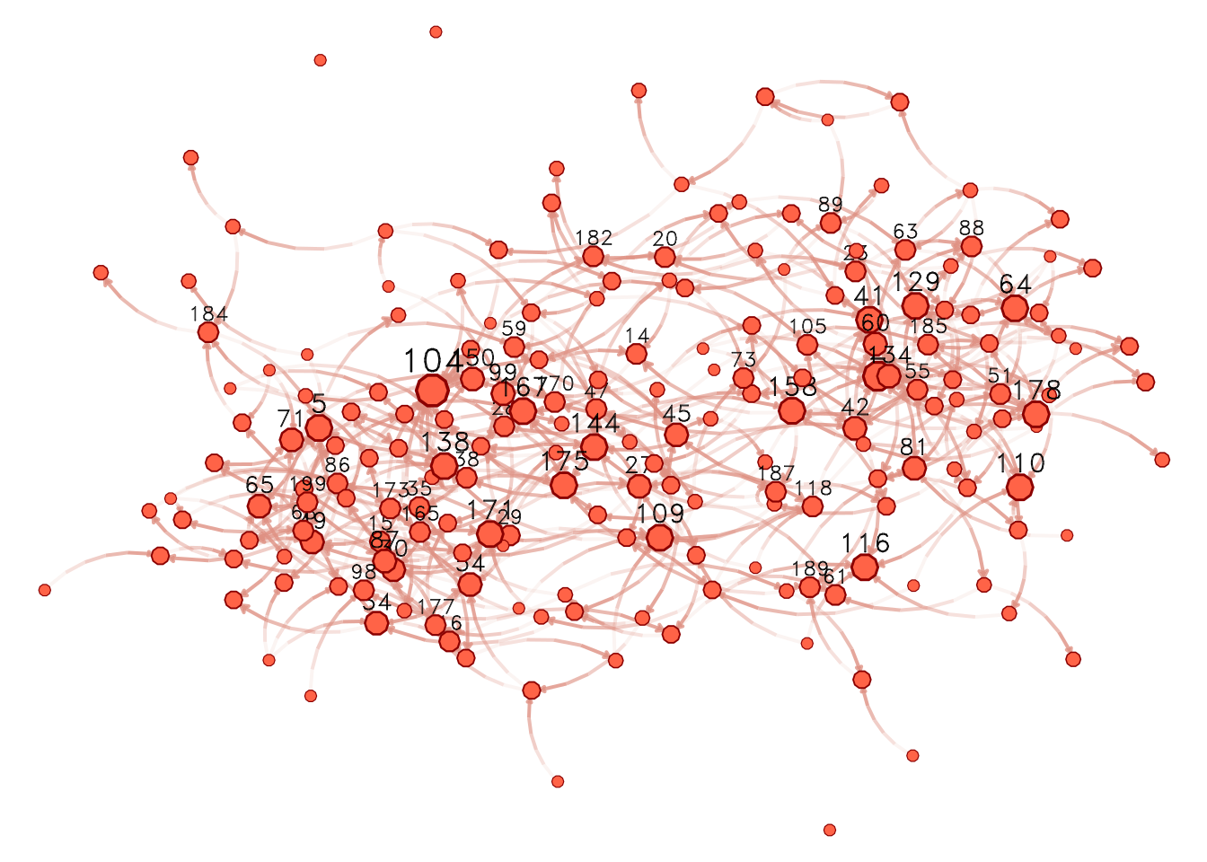
absdiff("age")term with parameter -0.5. This is, in rigor, a term capturing heterophily. Nonetheless, heterophily is the opposite of homophily.Let’s take a quick look at the resulting graph
We can now start to see whether we got what we wanted! Before that, let’s save the network as a plain-text file so we can practice reading networks back in R!